Note: This was written immediately following Selection Sunday 2024. If we can analyze what the committee values on Selection Sunday, it can help us understand what teams can do to make sure they have the best shot to get the seed they deserve.

Every year there is chaos, controversy, and confusion on Selection Sunday. 2024 is no different. Iowa State sits at #8 on the S-curve despite running through the Big 12 Tournament. Auburn, the SEC champ and advanced-metrics darling, got a 4-seed no one wants to face. At the same time, 14-loss Michigan State was comfortably in the field (9-seed) and bubble-team Texas A&M (also a 9-seed) comfortably avoided Dayton despite having 4 Q3/Q4 losses on the season.
What is going on? Is the committee schizo? Well, sort of. But it isn’t really their fault.
The NCAA Tournament committee’s job is to select and seed the best 68 teams for the bracket. To help it, it has certain principles as a guide. There are 32 automatic qualifiers and 36 at-large teams. So, they really only pick 36 teams. After the 36 are selected, they rank all 68. This two-part process is messy to a degree, as the AQ’s and at-larges mix until about the 12-seed or so (most years), after which the worst teams are always AQ’s.
For 2024, Championship Week saw numerous upsets and bid thieves, so the last four teams into the tournament (who make the play-in round in Dayton) were on the 10-line, which is the first time this has happened since the field when to 68. Before it has always been 11’s, 12’s, or even 13’s to make the First Four as at-large teams.
In order to help the committee decide who should be in the field, team sheets are used showing relevant information. This is what Houston’s looked like:
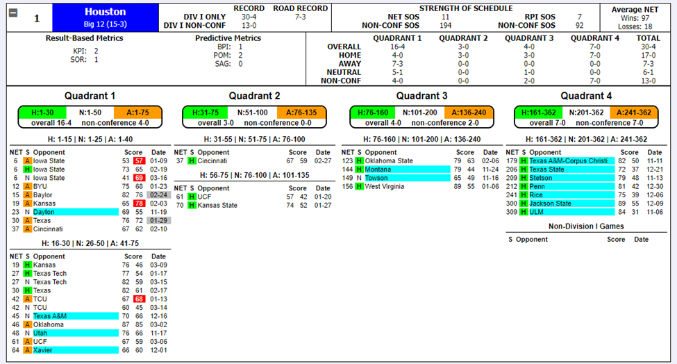
That’s quite a display of number and color. And this is just one team’s team sheet. Imagine going through nearly 100 of these, repeatedly, for hours if not days!
While we aren’t privy to the conversations of the committee, we do have the advantage of people doing bracket exercises which help us understand what the committee values. Believe it or not, bracketologists have some value to give us! Additionally, the committee chair normally hints or gives brief explanations regarding the committee’s decision after the release of the bracket. So we can make certain assumptions and guesses ourselves as we seek to understand the committee.
The Task at Hand
The exercise we’re engaging in is to attempt to quantify the committee’s preferences in terms of the information they have access to. For instance, what’s most important to the committee? Overall record? Quad 1 wins? Computer metrics? Strength of schedule?
There are a few types of criticism the committee sees. The first is that it fails to rank the teams as they truly are. This is a very difficult thing to assess, without first assuming some other metric which to judge the committee against. Instead, we want to study the consistency of the list. Based on the committee’s preferences; what numbers, metrics, etc. on the team sheets is it valuing?
To even get started, we have to identify what relevant numbers are even being evaluated, something we do using common knowledge of the sport of college basketball and clues from bracketologists and the committee chair. We’ve come up with 6 different categories:
- Strength of Schedule
- Overall Record
- Performance Against the Best – Quad 1
- Performance Against Good Teams – Quads 1 & 2
- Avoiding Bad Losses – Quads 3 & 4
- Advanced Metrics
Results
More detail will be provided later on how these are determined. But what we did was quantify these 6 categories by ranking teams in each, then weight each category based on its relative importance to come up with a weighted average score. We then ranked the field on this weighted average score and compared it to the committee’s own S-curve. We want the tightest correlation, so we played around with the weights of these 6 categories until we arrived at an R2 of 0.8793. The weights were as follows:
- Strength of Schedule (6.5%)
- Overall Record (0.0%)
- Performance Against the Best – Quad 1 (25.5%)
- Performance Against Good Teams – Quads 1 & 2 (9.5%)
- Avoiding Bad Losses – Quads 3 & 4 (Multiple)
- Advanced Metrics (58.5%)
There are some noteworthy things here. One, the raw winning percentage wasn’t factored in by the committee. This is to its favor. A team’s overall record shouldn’t matter per se, as the relevant numbers should be seen in other areas of the team sheets.
The next thing to note is that bad losses were calculated using a multiple. If a team has 0 bad losses, its overall weighted average goes down (improving its ranking). The more bad losses a team has, this affects its weighted average (worsening its ranking). Better to have 1 bad loss than 2, 2 bad losses than 3, and so on.
Finally, the advanced metrics accounted for a large proportion of what the committee valued. This isn’t necessarily terrible, as these advanced metrics taken into account what the committee looks for (i.e. good wins increase a team’s SOR, NET and KenPom ranking). But it is interesting, based on how closely the Quadrants are discussed, that just averaging a team’s computer metric component got you most of the way there.
Biggest Outliers – A Discussion of Certain Teams
Given how the committee viewed the importance of each item on the team sheet, let’s look at which teams were furthest from their final place on the S-curve. These outliers should generate the most controversy, because they are where the committee veered off most from their implied preferences.
Florida Atlantic
The Owls were the committee’s #31 overall team (earning an 8-seed), whereas the weighted ranking had them as the #46 team—just outside the at-large field. FAU’s resume was unique in that it had 3 Q3/Q4 losses. While the weighted ranking did indicate that the committee accounted for bad losses for most teams, it seemed to not do this for FAU. Though perhaps the weighted ranking over-penalized bad losses. Either way, FAU’s metrics were solid enough (all in the 30’s and low-40’s) and it played a solid schedule. But #31 is too high.
Colorado
The Buffaloes were the committee’s #39 overall team (earning a 10-seed and First Four game), 13 worse than their #26 weighted ranking. The Buffs could arguably be a 7-seed given their resume and what the committee valued most of the time. Colorado’s worst feature was its Non-Con SOS. Like Iowa State, this may have hurt it.
Boise State
The Broncos were the committee’s #38 overall team (and will face CU Wednesday night), but would have been #28 had the weighted ranking been used. Boise had good metrics across the board; nothing really stood out as being worthy of dropping them to the play-in game.
Kentucky
The Wildcats were “only” 8 spots off—the committee has them #11 while the weighted ranking has them #19—but since it is tougher to miss by many spots toward the top of the bracket, this was noteworthy. UK’s computer metric numbers were all between 18-21. It went 8-8 in Q’s 1&2. Whatever resume numbers you looked at in isolation; it was tough to place Kentucky as a 3-seed or top 12 team in any single of them. Yet they were given a 3-seed above teams such as Auburn or Duke or Kansas.
Others
These others, which were 8 spots off, will be listed in terms of boosted or screwed by the committee. Nevada was screwed. South Carolina was boosted. Colorado State was screwed, and is also a play-in team. Drake was boosted. Northwestern was also boosted.
Bubbles
Some bubbles have already been mentioned. The teams that were the most screwed out of making the tournament, given the committee’s implied preferences, were Oklahoma, Providence, and St. John’s. Virginia was boosted enough to get it in when it should have been out, but the boost wasn’t egregious. They were close given the committee’s preferences. FAU, as mentioned, would have been (barely) out. The other team that would have been out, if weighted average were used, was Northwestern.
What About…
Iowa State was actually only off by 1 spot given the committee’s implied preferences. With its computer metrics averaging over 5, ISU’s case for a 1-seed was always going to be dicey. But what hurt it most was undeniably its SOS score. Despite having the #16 NET SOS overall, its rank in this category was 63, far below the likes of UNC and Tennessee. What stuck out and pulled down ISU’s SOS was its #324 non-con SOS. One can argue that non-con SOS shouldn’t be considered (if we have overall SOS, what’s the point of looking at one portion of the schedule), but the committee sees that number and no doubt uses it in their considerations.
Michigan State, at 19-14, was thought to be gifted a Tourney bid. But the Spartans are actually only one spot off their implied rank given the committee’s preferences across the field. In other words, the same things the committee valued in seeding the rest of the field was applied to MSU. Michigan State had a great schedule overall (8th best according to this exercise) as well as solid computer metrics (being #18 in KenPom and BPI doesn’t hurt a team). This did enough to pull it up to an at-large berth without much sweat. Again, one can criticize what the committee values, but one can’t say it was being inconsistent by including Tom Izzo’s team in the 2024 Tournament.
Texas A&M had four bad losses but was the #34 team according to the S-curve. A&M earned a 9-seed, but maybe deserved a 10 given the committee’s preferences overall. Still, this team was getting in. It went 13-10 in Q’s 1/2 and had solid enough computer metrics.
And Finally… Not being talked about much is the fact Purdue dropped to the #3 overall seed, when many had it as the #1 overall for most of February and into March. The Boilermakers were the #1 overall ranked team according to the weighted rank, thanks to having the best SOS metrics in the nation and performance metrics right there with UConn and Houston. But the committee went with the Huskies and Cougars. Not that this matters much. The #1 overall seed hasn’t won March Madness since 2013, while 1-seeds from the other spots in the bracket have had success.
More Detail, How the Weighted Average Score was Calculated
All data was taken from what the committee had on Selection Sunday. The “Nitty-Gritty” info includes each team’s NET, Avg Opp NET Rank, Avg Opp NET, W-L record, Conf. Record, Non-Con Record, Road W-L, NET SOS, Non-Con SOS, and then results by Quads 1, 2, 3 & 4.
Additional data we needed to pull was each team’s computer metric scores (KPI, SOR, BPI, KenPom). All of these fields became the basis from which we ranked the field using the weighted average. As these categories are what the committee sees, we assumed these categories are what the committee uses to make its judgments.
The next step was the trickiest. How do we apply each of these data-points into sensible categories? After all, some of the information on the team sheets is redundant. After some thought, we came up with the six categories which were presented earlier. In more detail, here are these categories again.
Strength of Schedule
SOS ended up making up 6.5% of the weight. It wasn’t overly important, but it did affect teams like Iowa State. While overall SOS is included, the committee also saw SOS from a few other perspectives, including non-conference SOS. We calculated each team’s SOS sub-categories using percentiles, then found an average percentile, then ranked teams on that percentile. Purdue was #1, Kansas was #6, and Iowa State was #63. Of anyone in consideration for a 1-seed, ISU’s SOS was certainly the biggest outlier.
Overall Record
This is an appealing number, because it is prima facia easy to compare. A 23-9 record looks better than a 19-13 record. However, given SOS differences, this isn’t necessarily the case. To the committee’s credit, it didn’t utilize overall record at all according to the weighted average. This category was 0.0% weight.
Performance Against the Best – Quad 1
There’s no doubt the committee considers Quad 1 games in isolation, which was the gist of this category. They want to know how you did against the top teams in the nation. We looked at both overall wins in this quadrant as well as each team’s winning percentage in Q1 games. Weighting about 2 to 1 to overall wins (i.e. 11-5 is preferable to 8-3), we generated percentiles and rankings for this category. In total, 25.5% of the weight was put here.
Performance Against Good Teams – Quads 1 & 2
We didn’t think the committee looked at each Quad below Q1 in isolation per se, but because some teams don’t play a ton of Quad 1 games and once you get down the bracket not many teams have great Quad 1 winning percentages, we wanted to look to see how much the committee looked a teams’ records against “good opponents” broadly-defined. We had two sub-categories here, total wins from Quads 1&2 as well as the total net wins in these Quads (i.e. going 8-11 in Quads 1&2 mean a -3 net). Balancing these, we see that indeed the committee factored Q1&2 games into its ranking. In total, 9.5% of the weight was put in this category.
Avoiding Bad Losses
Quad 3/Quad 4 losses are seen as discounting a team’s ranking. But this wasn’t done by using weights as with the other categories. A team with 0 bad losses was given a multiple less than 1 (improving its weighted average score). From here, teams with 1 or 2 or 3 or more losses were given a multiple of increasing value (all over 1) which would increase their weighted averages and make them worse in the overall list.
Advanced Metrics
There are five computer ranking systems printed on the team sheets. NET, the NCAA’s performance evaluation tool; KPI, from Kevin Pauga; ESPN’s SOR, a resume-based metric; ESPN’s BPI, an efficiency-based metric; and KenPom, also an efficiency-based metric. The assumption, like with the other categories, was that these were employed by the committee as they were numbers the committee was seeing for each team. What’s clear is that the advanced metrics are being heavily used, and each is being used to some degree. In total, a whopping 58.5% of the weight was put here.
Calculating the Weighted Average
Teams are ranked in each category. From here, weights are applied in each category. Additionally, the bad loss multiple is applied to reward teams with no bad losses and punish teams with bad losses based on the number/severity of the bad losses. We then compare the weighted average ranking to the committee’s actual S-curve, and see how strongly the two lists align.
Using a simple correlation, we attempt to get the R2 as close to 1 as possible. For instance, if we applied 20% weight to each of the 5 categories (aside from the bad loss category, which is a multiple not a weight), we get a solid-enough R2 of 0.8265. After playing around with the weights, the highest R2 we got to was 0.8793 for the weights listed above. While not a perfect system, this is the best we could do without better coding skills.
In Closing
The committee’s preferred preferences matched the S-curve with a 0.8793 correlation. Is this good? Is it bad? Tough to say unless we compare it to other seasons. It clearly had some head-scratching calls, but also fit most teams close enough to what made sense. If we do this for other seasons, we can compare committees from different years to see which was the most and least consistent to its own preferences.
The flip-side is to analyze this from the perspective of teams looking to put themselves in the best possible place on Selection Sunday.
The best things for teams to do is to win games against good teams by as many points as possible. This will help your efficiency and resume metrics, which is what correlates most to the committee’s ultimate seed list (S-curve). Additionally, winning Quad 1 and 2 games (while avoiding bad losses) has a huge impact, and for a related reason. If you in Quad 1 and 2 games you are also improving your computer scores and if you are improving your computer scores it is likely due in part to you winning Quad 1 and 2 games.
What doesn’t help teams is to win “fluff” games. These do improve your overall record, but the committee admirably didn’t show any partiality for a team’s overall record. Sure, teams with great records tend to get great seeds. But this was due to these teams beating good (Q1 & Q2) teams, not just any team.
The last thing that affected a team’s S-curve spot was its SOS metrics. Remember that there are multiple SOS metrics the committee sees, including non-conference SOS. Having poor SOS marks had negative effects on teams’ S-curve ranks.
In wrapping this up, obviously a team wants to beat the best during the regular season so that it gets a top seed in the NCAA Tournament. But that’s easier said than done. Additionally, conference schedules are out of the control of the program, so teams have to do best with who they face in January and February. What coaches can do, on the other hand, is schedule difficult in the non-conference. The three reasons are straightforward: It doesn’t help to beat bad teams. It can only hurt if you lose to a bad team you schedule. A weak non-con SOS will be dinged by the committee. This is the lesson for Iowa State (and perhaps Texas Tech, Colorado, and Nevada).