
Below is a summary of how to interpret the stats published on this website. These stats will differ from the ones traditionally offered.
We will use the 2010 season numbers as a guide. Below are the offensive stats for the 2010 team.
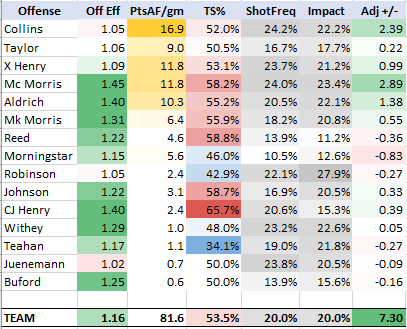
First, let’s start with how the players are sorted. The primary starting five are the first five listed, from point guard to center, 1-5. From here, bench players are listed in order of importance, with the sixth man listed sixth, seventh man listed seventh, and so on until the walk-ons are at the bottom.
Next, let’s look at Offensive Efficiency. Each player’s individual efficiency is calculated, as well as the team’s, and is shown as points per possession (used). For instance if a player produces 110 points and uses 100 possessions, his Off Eff is 1.10. Clearly, higher is better. The color formatting from red to green (bad to good) reflects the efficiency of what a replacement-level KU rotation player should show at average usage. For 2010, most of the team shows green or very faint colors because the team was well-above replacement level offensively.
The third column is Points Accounted For per game. This stat accounts for all plays in which a player creates points: the player scoring unassisted, the player scoring from an assist, as well as the player assisting a teammate’s score. Senior PG Sherron Collins led the team by accounting for 16.9 points per game, which was north of the 15.5 points per game he scored. Guards which tend to create more scoring opportunities–for themselves and others–produce more points for the team than what they actually score. In contrast, some wings and post men score a large portion of their points by finishing plays set up by others, so their PtsAF/gm numbers tend to be less than what their points scored per game is. The nice thing about this stat is that it combines points and assists into one number.
The fourth column is True Shooting Percentage. TS% is calculated by other sources, but the calculation here takes into account that assisted baskets are (or should be) easier to convert than unassisted baskets. It is takes into account actual possessions used on shots (instead of estimating them). This number won’t differ much from other sources, but it should more accurately reflect what occurred when the player shot the ball. The color formatting is from blue (cold) to red (hot). 50% is set as the neutral mark for formatting. Guard C.J. Henry led the team in this stat.
The fifth column is Shot Frequency, which looks at how often that player shot the ball while he was on the floor. The darker the gray is, the more frequent that player took the shot in comparison to his teammates. Looking down the list, one can see that KU relied more heavily on Collins, Marcus Morris, and Xavier Henry to take shots. With five players on the court at once, the average ShotFreq is exactly 20.0%.
The sixth column is similar to the last, and is called Offensive Impact. First, let’s confirm firm that the average Impact number is 20.0% for the same reason as above. But what exactly is Offensive Impact? As the name implies, it looks at how large each player’s impact was on the offensive end in comparison to his teammates. Knowledgeable fans will know what offensive usage is, and this stat is similar. However, Impact uses offensive rebounds differently. Instead of ignoring offensive rebounds or using them against offensive usage, we include them in calculating Impact just as we would a shot. Last, note that this stat and the one above aren’t a measure of value. In other words, Impact calculates all offensive plays–good and bad–that a player has during his minutes. Freshman Thomas Robinson was KU’s most impactful offensive player (28.0%) on a per possession basis, even though he graded out as a negative offensive value player.
The final column is Adjusted PPG +/-, or the value score for each player on the offensive end. This number includes all the information from the previous categories and puts it together in a way that balances offensive production and efficiency. It is also schedule-adjusted to account for the relative strength of opponents. Marcus Morris led the team in this category for 2010 at +2.89. Looking back at earlier columns, we can see he is at or near the top of each offensive stat. The +2.89 number means that he was 2.89 points per game better on offense than a KU-level replacement player at his position. The team score of +7.30 is also very good.
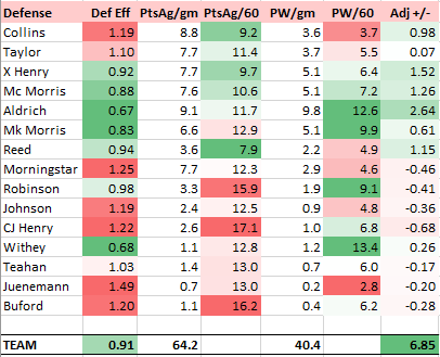
The Defensive stats published on this website far exceed what an official box score can provide. The primary difference is that each point scored by the opponent is counted against the KU defender who was most responsible. This will be explained further below, but it allows us to better grade individual defense instead of having to guess each player’s defensive impact, as other advanced statistical models do.
The Defensive Efficiency column is like its offensive counterpart…points allowed divided by possessions won. The color formatting is inverse offense, with higher numbers being worse. To explain another way, take a look at Sherron Collins’ 1.19 score. This is saying that for every defensive possession that Collins was responsible for, his opponent scored 1.19 points. Def Eff will be tend to be better among big men who grab far more rebounds than small guards.
The next two columns are similar, Points Against per game and Points against per 60 possessions. These stats are carefully charted by observing game film (among other methods) to assign points allowed by individual defenders. Because of the differing minutes played for each player, the PtsAg/60 offers the best look at scoring defense. The color formatting, from green (good) to red (bad) indicates that Tyrel Reed was the team’s best at not allowing his man to score, followed by Collins and Xavier Henry.
The following two columns are likewise similar to each other, Possessions won per game and Possessions won per 60 possessions. To “win” a possession, a player must rebound, block a shot, steal the ball, or force a turnover so that his team gets the ball back without the other team scoring. As one can see, big men excel at winning possessions. This is primarily through rebounding numbers, although blocked shots and forced turnovers also play a part for big men with active hands.
The final column is Adjusted PPG +/-, or the value score for each player on the defensive end. It takes into account a player’s points allowed along with his possessions won, awarding more value to defensive plays that occurred before a shot (steals, forced turnovers) than those that were the result of a miss (rebounds). It is schedule-adjusted to account for the relative strength of opponents. Cole Aldrich led the team at +2.64, bolstered by his rebounding and shot-blocking prowess. Of note might be the large difference between Tyrel Reed and Brady Morningstar. Reed was an underrated defender; whereas Morningstar was the opposite.
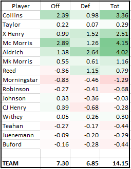
The last box combines the offensive and defensive PPG +/- stats into one total number. 0.00 is replacement level (think 7th or 8th man on a KU roster), someone who doesn’t help his team much but doesn’t hurt their chances either.
For 2010, Marcus Morris led the team with a +4.15 score, although Cole Aldrich at +4.02 was statistically identical. The 2010 had tremendous balance and depth, though the bulk of the value was from the top seven players. The team’s score of +14.15 was the third best since 1993, with only the 2008 and 1997 teams scoring higher.

One thought on “Season Stats: Interpretation”